Tuesday, December 22, 2009

Put your weed in it...


The wooden laptop case by Rainer Spehl is the perfect compliment to the wooden veneer portfolio from Veer.com. Theres just something about a wooden laptop case holding all that plastic, metal and mercury that gets me. Not only is the computer going to last a 1,000 years (if I'm not p.c. and recycle it), I killed a tree to protect it just that much longer. Sweet. It is cool though, isn't it.
Now all I need is the computer...
Check out more wood stuff at iheartwood.com

Friday, December 4, 2009

Chopping Up for a Cause


As a creative outlet, I started an online business called Buffalo T-shirts. I sell Buffalo themed, limited-edition graphic tees and other stuff-specifically posters at this point. I have one poster design that I had printed in limited quantities and sales have been pretty steady-no complaints. This week, I'm participating in the Artists in Buffalo Open Studio sales event and am setting up shop at Gilda's Club WNY. 20% of all sales goes directly back to Gilda to support her cause. I have a vested interest in the Club as it was a great help to a loved one as she kicked cancer's ass a couple years back...she absolutely loved Gilda's Club-they really know how to help take your mind off your struggle and thats an absolute great thing–a true gem for the city.
Anyhoot, I wasnt sure what kind of space I had and was concerned I couldnt display all three poster colors, so I chopped the three up and created one poster so people could see the color combos I had to offer. I had no idea people would love what I did. So there you have it-accidently on purpose-I'm on to something. I'm offering these chopped up posters only at Gilda's club. Ill frame it for you for $60 bucks and ship it (or drop it off) FREE by Dec. 23rd. They're pretty cool, right? Oh, you can also pick up the regular posters at Gilda's too. One for $20, 2 for $35 (any combo tee/poster).

Tuesday, December 1, 2009

New Postcard Design for local Buffalo jeweler


I recently had the chance to assist a local jewelry store create a direct mail postcard for the local Buffalo NY area. Korona Jewelry, 1588 Hertel Ave, Buffalo NY contacted me through Buffalo First's Business Directory and asked if I could help them get a postcard out the door. In less than a week, we had the quotes from local printers/mailhouses, sent them rough concepts, got approval, created the final artwork and got it out the door!
They had originally received quotes from printing and mailing companies online and although the quotes we got from local companies came in a bit over those, Joe and Noreen Korona saw the benefits of keeping the money in WNY utilizing local vendors–big ups to them–and all the more reason to stop on in and support them and our local economy. Did you know: 3X more money stays in the local economy when you shop local? It's true.
They originally had a rough layout when I stopped in to talk to them, but I saw that they were missing something in the design. By using similarity of design, we created the postcard to look like a gift box: pearls as ribbon, the pendant as a bow, their logo on a gift tag placed on top a striped background really told the story of the holidays. To further the design we utilized the diamond ring as an "O" (again, similarity of design) in the "Hoooooh!". On the back we rearranged the text hierarchy with a bold callout and call-to-action and emphasized the redeemable coupon. Topping it off is the Buffalo First logo to highlight Korona Jewelry's local roots as Buffalo First members. Should be dropping this weekend in the 14216, 14214 zip codes-look for 'em.

Thursday, November 26, 2009

Local Business featured on Reuters Blog


An article about local shopping and business is featured on the Reuters blog. Amy Kedron, founder of Buffalo First, was interviewed about the local economy and the 2010 all local coupon book. My work was shown in one of the images on the blog (see above, pat-pat)

Thursday, November 19, 2009

Buffalo First 2010 Coupon Book Design


Just sent out the files for printing of the 2010 Buffalo First Coupon Book. This book helps support the local economy by stressing the importance of shopping local. The book features over $4,000 in coupons to local, independent businesses across Buffalo and WNY. This years book was 50% larger than our inaugural version last year, which shows that us Buffalonians are a good group of consumers.
This year Courtney Creative designed 4 different covers (2 shown above) showcasing some areas across the city that we hope the consumer may find appealing. The inside features full page duotone images of local attractions/businesses highlighting the uniqueness of our region.
"Gosh, wasn't printing 4 different covers expensive to do?"
You may be surprised to find out it wasn't at all. It costs a bit more for printing plates and design, but projects of this size are usually 4, 8 or more up on a sheet while printing. This happens to be 8-up, which means on each sheet of paper run thru the offset printer, we produce 8 covers (2 of each design). Since the inside of the books are all the same and we weren't worried about collating the versions, its barely a bump in the cost/billing road. Keep it in mind for an upcoming project that might do well to have different covers for different target audiences. If you're selling a widget to hospitals and HMO's, it might make since to tailor the design to each specific audience.
If you're out and about in a couple weeks and looking for a nice stocking stuffer-support our local merchants and pick one of these books up for just $15 (over 50% of the revenue from the sale of each book goes directly back to the business selling it to you). You can find out where on the Buffalo First web site.
Courtney Creative has a coupon in the book: Get 25% OFF any project. So if you need some design help, get the book and save yourself some cold, hard cash money.
DID YOU KNOW: For every $100 spent shopping, $68 stays in the local economy when you shop local compared to just $43 shopping at non-local companies. Now you know. BUY LOCAL!

Friday, October 30, 2009

High Billy Mays Here with OxiCaine!


A friend of mine is playing dress-up this Halloween and going as the dead Billy Mays. He figured he'd just grab a bucket of OxiClean and call it a costume. I called bullshit on that, renamed the product and took an hour last night to put together a more cheeky label for the tub o' clean. And since Im in the halloween spirit I thought I'd offer it up to the masses if you or a friend are planning on going as the spirit of Billy Mays this weekend. Below is a link to the high res jpeg file. It'll fit on an 11 x 17. Attach with spray mount or tape. Just download it, print it, cut it out on the pink line (called a dieline for you novice) and forget it!
OxiCaine Label

Saturday, October 17, 2009

Alphabet Chefs


My friend and her gals are starting a new blog based on the Sept. issue of Gourmet Magazine where they did the A-Z of recipes. They needed a logo and we delivered.

Buffalo Development Corporation


Mark Croce has announced he is renovating the Curtiss Building into a 57-room upscale hotel. With that announcement he needed a new logo for his development corporation. His logo needed to be: strong, aggressive and most definitely Buffalo inspired. We were able to take the initials of the company, BDC, and create a logo that hits all three brand attributes. See it?

Monday, July 13, 2009

Post-This


No logo. No words. Just entertaining.

Tuesday, July 7, 2009

The Short Answer to Social Networking and Business


A friend of mine posed this question today:
"I have a couple of business/friend acquaintances who I have been urging social networking stuff to. Is it helpful? Does it bring in business? What is your take on social networking and business?"
If it's done right and you cross-promote through several sites, it works wonders. Thats the only way I promote [Buffalo T-shirts] as they dont have a bricks-n-mortar store and have a limited budget. Its more about connecting and participating with current customers and having them chat about your product/business thereby increasing 'brand' awareness. It's less about actual sales. Although if done right and on a consistent basis, those come as more people get acquainted with your product/service.

There is obviously alot more to it. In terms of helping business there's no doubt that as long as a brand has a voice that an audience finds interesting and engaging, this social interaction can only help with brand awareness. As a 'brand' gains awareness, sales seem to follow.

Tuesday, June 30, 2009

Not Sharpie Enough

I stumbled upon this ad today and it took me a couple minutes to say, "Whoops, that ain't right." Take a look and try to figure out how/where this ad fails...

Give up? In magazines/newspapers, an advertiser normally fights to have their ad on the right hand page because as a reader flips thru the pages, the right page is the first page they see/read. Because of this, the reader actually reads the pay-off to this ad prior to reading the left side. While its a great creative use of the spread and good art direction, the delivery fails because the information should really be reversed. The 'reveal' and signoff (logo/website, etc.) should fall on the left page and the initial message, "Two times the Pen." should fall on the right where the reader would read it first.
Now Im wondering who made the mistake: the ad agency or the company's communication department... I'm leaning towards the latter.
Regardless, it's still my favorite marker.

Tuesday, May 12, 2009

Good work doesnt need to cost a great deal


Heres a quick little article on guerilla marketing in Portland (VIA Group) for the Salvation Army. I'll use this type of advertising here and there in Buffalo as the concentration of people is centralized in a few areas. Blanket Elmwood with some chalk 'ads', tag some napkins, etc. with a $12 rubber stamp and leave a bunch of 1-c bumper stickers.

Thursday, May 7, 2009

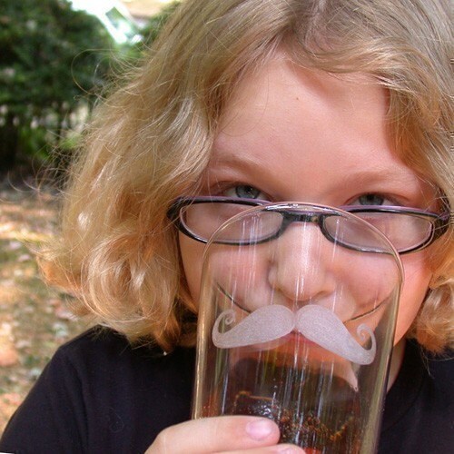
The Stache.


Saw these on Etsy and thought they were cheeky. The Stache Glass.
Fun stuff!

Thursday, April 23, 2009

New Business Identity System Revealed

Recently, I was asked by a client to update their identity system of one of their specialty companies. The timing was perfect as they were introducing a new state-of-the-art Electroless Nickel Plating solution for their customers. Below is shown the old logo and business identity system:


As you can see, its a straight-forward utilitarian system which 'worked' for them for many years. 'Worked' in terms of they had a card and letterhead. But were they really 'working' for them? Certainly not as well as they could. The logo was very dated and it didn't speak about the company. The letterhead and business card are inconsistent in terms of lockup and typography. Overall, they needed a brand new look to compliment their new services.
AFTER:

Early last year we had updated the identity of the parent company, Pellets LLC (above), and decided that we would keep the colors and feel consistent between the two brands: hence the black and blue color scheme and the block-style logo. We've successfully created a brand identity that is sophisticated, consistent and strong thru the use of color and design elements that will shed a new light on this state-of-the-art company.

Interested in having us do the same for your company? Email me at david[at]courtneycreative[dot]com or call 716.553.5066. I'd love to have a chat.

Reblog this post [with Zemanta]

Friday, March 27, 2009

Buffalo Map


Print study for linoleum cut.

Thursday, March 26, 2009

Very Cool Photography Concept


Check out these Flickr images of old photographs in present day locations. Ill be keeping this idea in the ole back pocket for sure... big ups to Jen over at Kodak for the tweet. (twitter.com/kodakCB)
Looking Into the Past

Thursday, March 12, 2009

Separated at Birth?

While pushing tees for Buffalo T-shirts yesterday someone mentioned that the lowercase Buffalo shirt reminded her of the Loblaws Supermarket logo. First let me say I was a big fan of Loblaws so I wasnt surprised that perhaps I borrowed from the design. After all, there is nothing new anymore, right? All design is borrowed and re-hashed. When I was a kid it was the only market in the Hamburg/Lakeshore area worth its salt (located at the South Shore Plaza). I still have my 1982 hockey sticker book from Loblaws-complete with Trottier, Bossy, Potvin and The Great One.
So last night, I jumped on the internet and checked out the evidence. While there are similarities in the curvature of the mark, I conclude that I didn't borrow from this logo. I still contend I borrowed from an old California t-shirt graphic from the 70s, although I cant find any supporting images for this theory.
I submit the following for review:


(This limited edition shirt is almost sold out. I have 1 XXL and 3 Lg. Get it now for $21.99 and Ill ship it free.)


Tuesday, March 10, 2009

Color Trends for 2009


Yeah, its a bit late for this but I came across this post and it always helps to have some trendy color schemes to check out. Enjoy!
Color Trends

Monday, March 9, 2009

Great concept and decent photography


I really enjoy this ad-maybe its the nice photography or that Im a sucker for wood grain. Its one of those ideas that I look at and go, "Of course, its so simple."
Im not too excited about the layout. I think the drill placement might be a wee bit small and shouldnt it be pointing into the pic? I might actually redo that whole bottom section.
The copy is short and concise if not a bit awkward: "Unexpectedly powerful"

Monday, March 2, 2009

Zip Zip USB Memory Brick


These are a must have for anyone that is in the market for a new zip stick. Cheeky monkeys.
From Site:
Each Zip Zip Memory Brick is a high speed USB 2.0 flash memory stick disguised in a plastic toy building brick.

Zip Zip Memory Bricks connect together

When in use the lid clips onto the memory component, preventing accidental loss.

Windows & Mac compatible
Keyring attachment and lanyard included
International postage is only US$4 per unit
Zip Zip can provide customised orders for companies looking for a unique promotional product. Click the 'corporate branding' header for more details about the corporate branding of Memory Bricks.

Friday, February 13, 2009

The all important first post


Hi internet, My name is David Courtney and Ive been in the advertising biz in Buffalo NY for about a dozen years or so as a designer/art director and have had good luck making a living at it. Ive won some awards here and there, which are nice ego boosters but in the long run don't equate to anything more than a trophy or two on a shelf. My work has promoted and produced results for clients-which is the real metric.
In the past couple years Ive left the agency life and have struck out on my own. Its been a great couple of years in that its forced me to take things into my own hands and chart my own course of action. My one weakness that has held me back is my back of the house attitude. In my past life I was a sous chef-working long hours in the kitchen with the dishdogs and night owls. I could be myself in the back of the house and not have to worry if I offended or crossed any lines. Anyone that has worked in a restaurant knows the lines in a kitchen are pretty broad and anything goes. I've seen everything from all out brawls to guys humping legs like dogs in heat. Its all on when you're 3 pages behind and a ten-top is waiting in the wings. All of that got us through the long, sweltering nights in a 120 degree heat, but doesn't work in the white collar business world.
Which brings me here-to the blog. Ive noticed I need to get my thoughts and ideas about advertising and design out to people, or at least out of my head and on 'paper'. I need a bigger voice.
So I hope to talk about advertising I like; that works; that doesnt; that sucks. Ill show things Im working on and hope to get comments from the gallery, answer questions from other businesses and just be honest about advertising and design. I wont always be right, but at least Ill have an opinion.